
To say the least, car companion apps are really below par considering the amount of money one has to pay for a new car these days. It would be acceptable if car brands here and there didn't have good apps but unfortunately, the problem of boring and unimaginative car app designs are found in most. Whether it be Mercedes, Audi, BMW, Volvo or Porsche, none of the major car brands have an app which can totally satisfy it's customers. This shocks me in so many ways considering how much you have to pay for a car but also how much it costs to maintain everything.
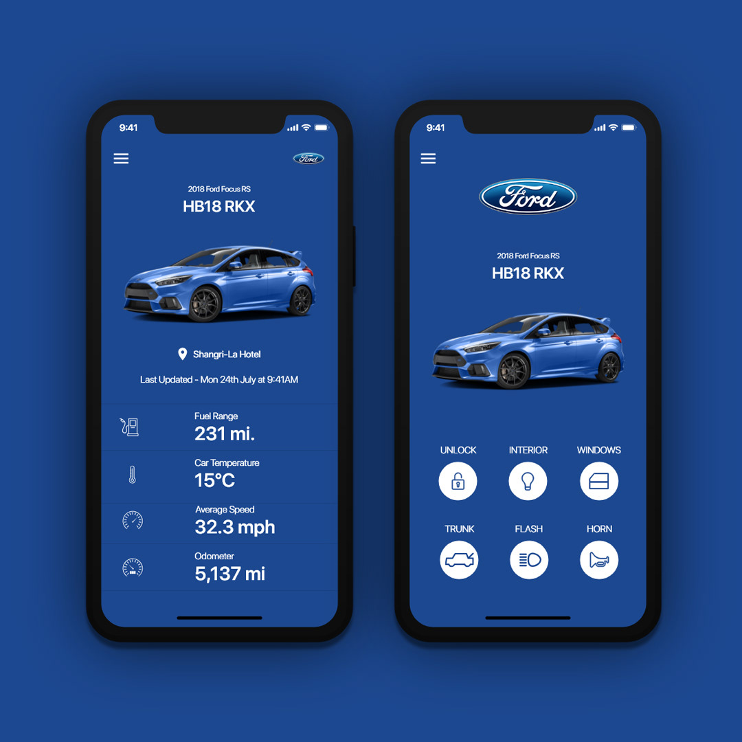
Above we have two screens which display common information found within a car companion app. Rather than it being filled with text, boring black and white and awful layout design, I have opted to go down the route of icons, allowing the user a more pleasant user experience. In addition, all information is displayed clearly with icons supporting the text which allows the user to understand what they are looking at within a matter of milliseconds.